This page intentionally left blank. ⬇️, ➡️, or spacebar 🛰 to start slidedeck. --- # Universal Design --- # Universal Design - Universal Design is about making everything accessibile to all people, regardless of age, ability, status, or other factors. - “to enable the widest possible range of users to benefit” (Shneiderman & Hochheiser, 2001) - It's about making things **accessible by default** - Fundamentally, it's about **empathy** --- # Thanks, NCSU Center for Universal Design - North Carolina State University [Center for Universal Design](https://projects.ncsu.edu/ncsu/design/cud/index.htm) - [Principles of Universal Design](https://projects.ncsu.edu/ncsu/design/cud/about_ud/udprinciplestext.htm) --- # Principles of Universal Design 1. Equitable Use 2. Flexibility in Use 3. Simple and Intuitive Use 4. Perceptible Information 5. Tolerance for Error 6. Low Physical Effort 7. Size and Space for Approach and Use Let's step through each of these... --- # 1. Equitable Use - 1a. Provide the same means of use for all users: identical whenever possible; equivalent when not. - 1b. Avoid segregating or stigmatizing any users. - 1c. Provisions for privacy, security, and safety should be equally available to all users. - 1d. Make the design appealing to all users. Example? --- .center[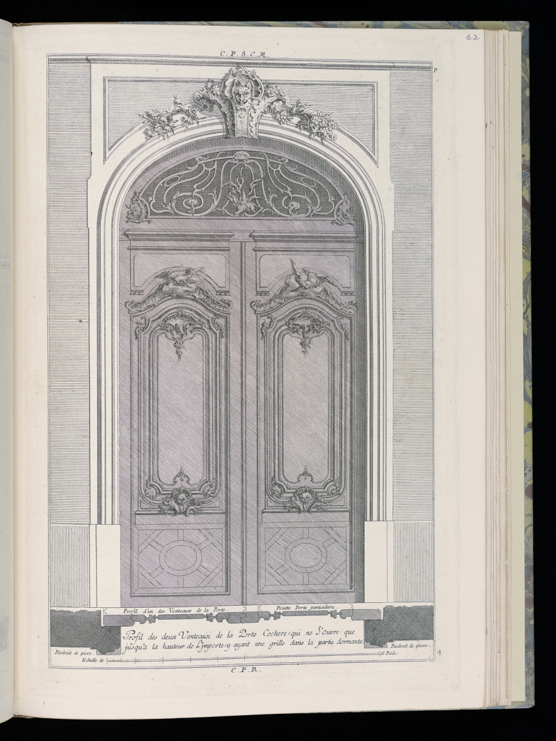] - [Smithsonian: Profil de deux Venteaux de la porte Cochere (Profile of Two Venteaux of a Carriage Door), Livre de Portes Cocheres (Book of Carriage Doors)](https://www.si.edu/object/chndm_1921-6-282-63) ??? Auto-opening doors (not like these) --- # 2. Flexibility in Use - 2a. Provide choice in methods of use. - 2b. Accommodate right- or left-handed access and use. - 2c. Facilitate the user's accuracy and precision. - 2d. Provide adaptability to the user's pace. Example? --- .center[] - [Smithsonian: Scissors](https://www.si.edu/object/fsg_F1917.612) ??? Scissors that are left or right-handed --- # 3. Simple and Intuitive Use - 3a. Eliminate unnecessary complexity. - 3b. Be consistent with user expectations and intuition. - 3c. Accommodate a wide range of literacy and language skills. - 3d. Arrange information consistent with its importance. - 3e. Provide effective prompting and feedback during and after task completion. Example? --- .center[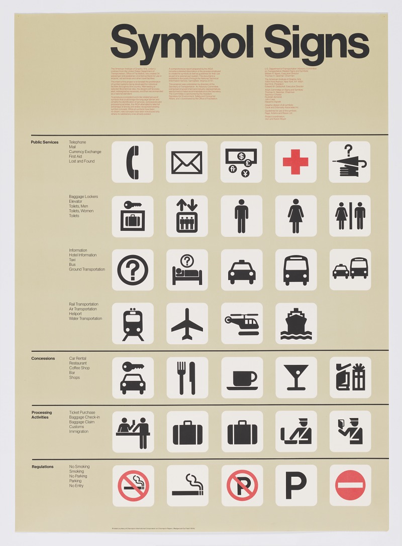] - [Smithsonian: Symbol Signs](https://www.si.edu/object/chndm_1997-19-136) ??? Instructions that use visuals instead of written --- # 4. Perceptible Information - 4a. Use different modes (pictorial, verbal, tactile) for redundant presentation of essential information. - 4b. Provide adequate contrast between essential information and its surroundings. - 4c. Maximize "legibility" of essential information. - 4d. Differentiate elements in ways that can be described (i.e., make it easy to give instructions or directions). - 4e. Provide compatibility with a variety of techniques or devices used by people with sensory limitations. Example? --- .center[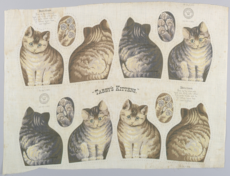] - [Smithsonian: Tabby's Kittens](https://www.si.edu/object/chndm_1964-53-3) ??? Instructions that use visuals instead of written --- # 5. Tolerance for Error - 5a. Arrange elements to minimize hazards and errors: most used elements, most accessible; hazardous elements eliminated, isolated, or shielded. - 5b. Provide warnings of hazards and errors. - 5c. Provide fail safe features. - 5d. Discourage unconscious action in tasks that require vigilance. Example? --- .center[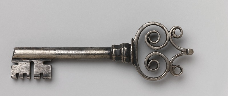] - [Smithsonian: Key](https://www.si.edu/object/chndm_1952-161-37) ??? Keys that can be used both ways (not like this) --- # 6. Low Physical Effort - 6a. Allow user to maintain a neutral body position. - 6b. Use reasonable operating forces. - 6c. Minimize repetitive actions. - 6d. Minimize sustained physical effort. Example? --- .center[] - [Smithsonian: Design for Advertising, tables, desks, chairs, and lamps](https://www.si.edu/object/chndm_1988-53-5) ??? Lamps you can touch to turn on --- # 7. Size and Space for Approach and Use - 7a. Provide a clear line of sight to important elements for any seated or standing user. - 7b. Make reach to all components comfortable for any seated or standing user. - 7c. Accommodate variations in hand and grip size. - 7d. Provide adequate space for the use of assistive devices or personal assistance. Example? --- .center[] - [Smithsonian: Albert Potter - Modern Music](https://www.si.edu/object/saam_1989.11.1) ??? good - subway auto-open doors. bad - subway gates. --- # Other examples There are endless other examples of how designs can be good or bad for everybody. [U of Buffalo Digital Collections](http://digital.lib.buffalo.edu/collection/SAP001/) provide another collection of products focused on Universal Design. --- # Digital world A lot of these examples are based in the physical world, but this applies to the digital world too. How can websites be designed in a way that allow for better access for everybody, and inclusive of everybody? [This web style guide](https://www.webstyleguide.com/wsg3/2-universal-usability/3-universal-design.html) provides examples of the Universal Design principles and how they can be used in the digital content space. --- # Additional Resources - Wikipedia: [Universal Design](https://en.wikipedia.org/wiki/Universal_design) - NCSU: [Poster with Principles of Universal Design](https://projects.ncsu.edu/ncsu/design/cud/pubs_p/docs/poster.pdf) - [Web Style Guide- Chapter 2: Universal Usability](http://www.webstyleguide.com/wsg3/2-universal-usability/index.html) --- # Learning more - [Accessibility](/presentations/accessibility.html) - [Transcription](/presentations/transcription.html) - [Writing for Technology](/presentations/technical-writing.html) [Home](/)